First impressions sell homes. Listing photos, drive-bys, and open-house moments all start at the same focal point: the front door. If you’re aiming to increase property value with door color, a well-chosen shade—applied with the right prep and finish—can make your entry look newer, sharper, and more expensive in a single weekend.
Below, you’ll find a skimmable framework: which colors attract buyers, how to choose for your architecture and materials, how sheen affects perceived quality, and the exact steps to test, prep, and paint for results that last.
Why the Front Door Punches Above Its Weight
- Curb appeal multiplier: A crisp, well-colored door tightens up the whole façade by emphasizing clean lines and fresh trim.
- Photogenic impact: Online listings are won (or lost) in thumbnails. Strong door contrast reads clearly on small screens.
- Low cost, high return: A quart or gallon of premium exterior enamel and a few tools can make the home’s exterior look “recently updated.”
- Market psychology: Buyers infer overall maintenance from a handful of details. A flawless, intentional door color signals care and quality.
For broader palette ideas to support siding and interior touches, see our guide to paint colors that increase home value, then use this article to zero in on the entry strategy.
The Quick Framework: How to Increase Property Value with Door Color
- Honor the architecture. Colonial, Craftsman, Mediterranean, mid-century—each style has colors that feel “native.”
- Read the fixed elements. Roof, brick, stone, pavers, and gutters all have undertones you must coordinate with.
- Choose contrast or harmony (on purpose). Either make the door the star or let it blend into a cohesive, upscale whole.
- Match the sheen to the story. Higher gloss = upscale and durable; satin = quiet luxury; both must suit the material and texture.
- Test in real light. Sun angle, shadows, and landscaping tones change how colors read throughout the day.
Buyer-Approved Color Families (And Why They Work)
These shades consistently help increase property value with door color because they feel current without being risky:
Navy & Deep Blue
- What buyers see: Trustworthy, classic, tailored.
- Pairs with: White trim, gray siding, cooler red brick.
- Tip: Choose a navy with a whisper of gray to avoid “nautical neon” in full sun.
Charcoal & Near-Black
- What buyers see: Modern, crisp, high contrast.
- Pairs with: Light stucco, pale fiber cement, natural stone.
- Tip: If the façade is already dark, add a metal kickplate or warm brass hardware for definition.
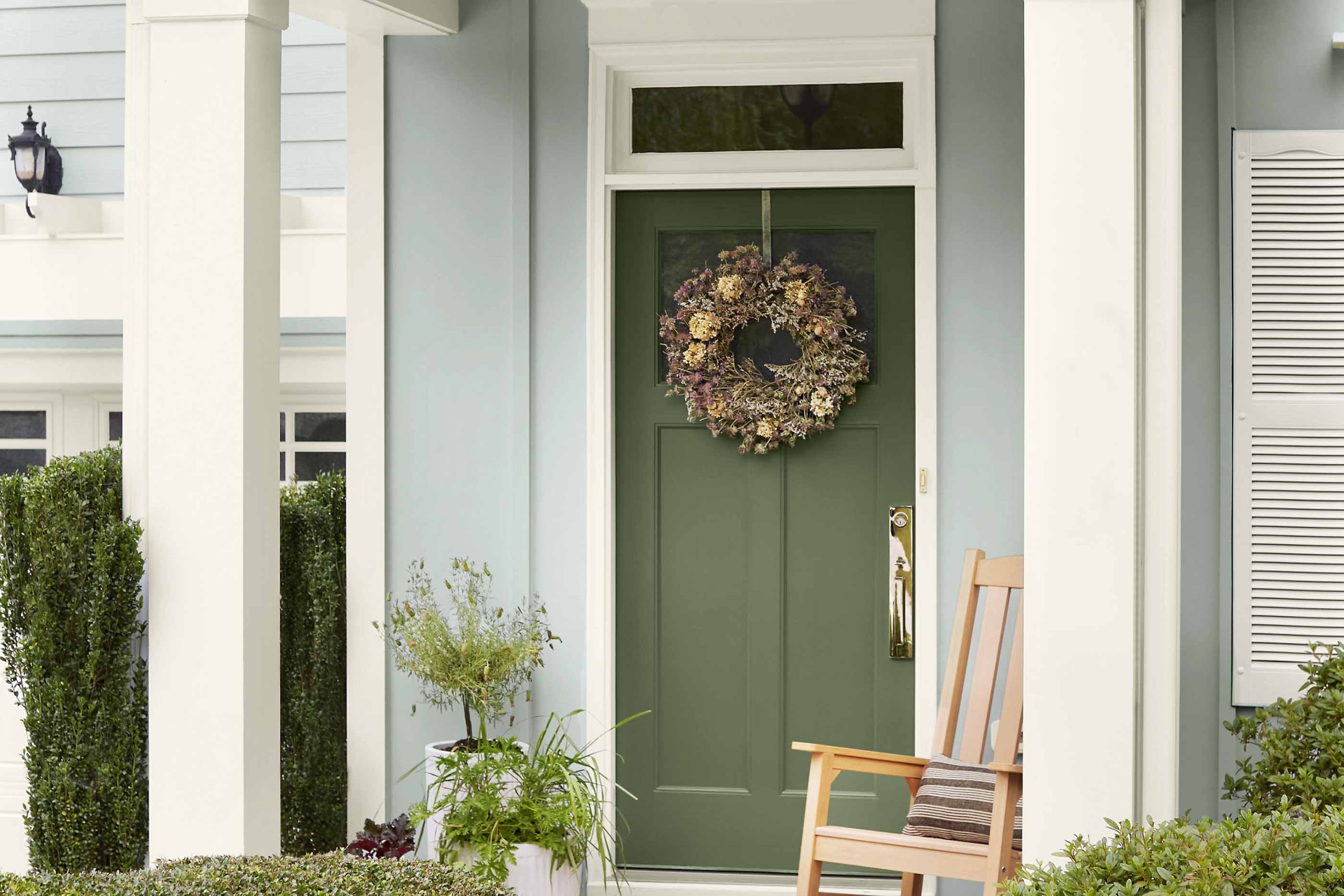
Forest, Spruce & Sage Green
- What buyers see: Calm, grounded, organic.
- Pairs with: Brick, stone, wood accents, neutral siding.
- Tip: Sage leans elegant on older homes; deeper greens read upscale on contemporary elevations.
Muted Red (Cranberry, Oxblood)
- What buyers see: Heritage focal point without shouting.
- Pairs with: Cream trim, warm brick, taupe, or greige siding.
- Tip: Add a touch of brown to keep it sophisticated.
Teal & Blue-Green
- What buyers see: Fresh, coastal, cheerful.
- Pairs with: White trim, light gray or sand siding.
- Tip: Keep the saturation moderate; mid-tones photograph best.
Warm Wood Tone (Stained)
- What buyers see: Natural quality and texture.
- Pairs with: Black or bronze hardware, crisp white or charcoal trim.
- Tip: Works beautifully on modern and Craftsman doors with strong grain or panel detail.
Contrast vs. Harmony: Two Winning Strategies
- Contrast (statement door): Light siding with a charcoal/black/navy door creates a bold focal point that stands out in photos. Dark siding with a brightened mid-tone (teal, spruce) grabs attention without feeling loud.
- Harmony (quiet luxury): Choose a door color two to four steps darker than the siding within the same family. The result feels cohesive, “custom,” and high-end—great for move-up buyers who favor restraint.
Pro move: Echo the door color in a small planter, house numbers, or a mailbox accent to make the scheme feel intentional.
The Undertone Rule (Ignore at Your Peril)
Undertones decide whether your door looks expensive or “off.” Check your fixed elements:
- Warm stone/roofing (brown, tan, red clay): Favor warm-leaning navies, greens with olive, charcoals with brown.
- Cool stone/roofing (blue-gray, pewter): Favor cool navies, blue-greens, or charcoals with a blue note.
- Brick: Identify whether the brick reads orange-red (warm) or raspberry-red (cool) and adjust the door hue accordingly.
Simple test: Place your paint sample against the stone/brick and your trim. If either surface turns drab or oddly yellow/pink by comparison, adjust the door color’s undertone.
Sheen & Finish: The “Luxury” Dial
- Gloss / High-Gloss: Maximum depth and wipeability; reads upscale and highlights panel detail. Needs very smooth prep.
- Satin: Balanced elegance with lower glare; forgiving on slightly textured or weather-worn doors.
- Avoid flat: On front doors, it scuffs quickly and can read chalky.
Hardware synergy: Matte black or antique brass against deep door colors creates a custom look. If you’re repainting hinges/knobs, match sheens so components feel like one curated set.
Material Matters: Wood, Fiberglass, Metal
- Wood doors: Sand with the grain, spot-fill dents, and consider a stained finish when the grain is beautiful. Use a sanding sealer or conditioner before stain for an even tone.
- Fiberglass doors: Clean thoroughly, scuff with a fine abrasive pad, and use coatings rated for fiberglass.
- Metal doors: Degrease, remove rust, feather the edges, and apply a rust-inhibiting primer before topcoating.
Weatherstripping and thresholds collect grime—clean these, so your fresh paint isn’t visually competing with dingy edges.
Step-by-Step: From Swatch to Showpiece
1) Sample Like a Pro
- Paint large boards (12″×18″) rather than tiny chips; view morning, midday, and evening.
- Place samples vertically on the actual door to read them in shadow lines and near your trim.
- Narrow it down to 2–3 finalists that still look great in overcast conditions.
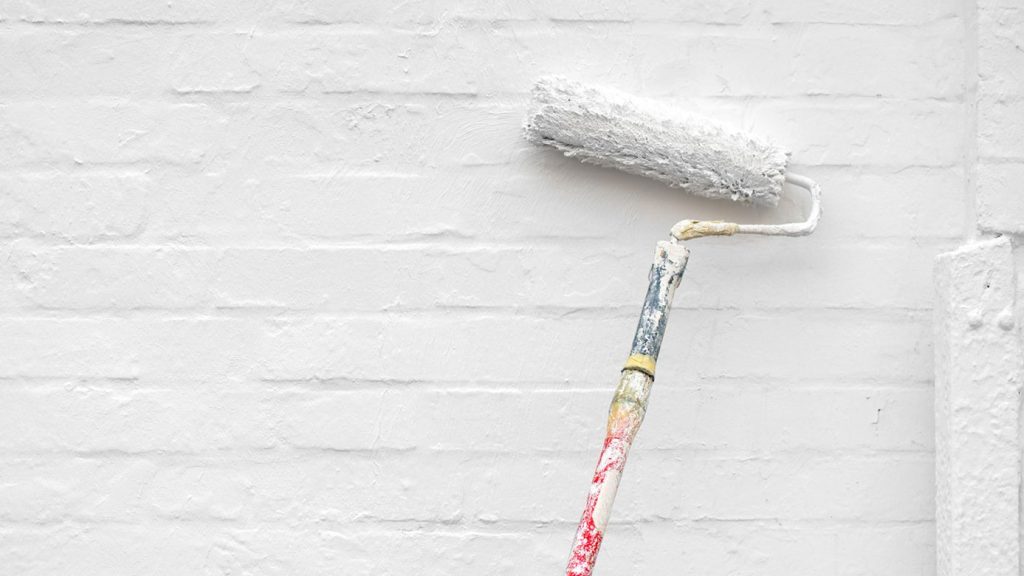
2) Prep for Adhesion (and Permanence)
- Wash with a mild exterior cleaner; rinse and dry.
- Scuff sand to break the existing sheen (120–180 grit).
- Fill cracks/dings with exterior wood filler or metal filler as needed; sand smooth.
- Prime wisely: bonding primer for slick or previously oil-based finishes; stain-blocking primer for tannin-prone wood.
- Mask hardware and glass cleanly; remove the door to sawhorses if conditions allow.
3) Choose Quality Paint
- Exterior enamel designed for doors & trim offers flow, leveling, and durability.
- If the sun beats on the door, consider UV-resistant formulas to retain color depth.
4) Application Technique
- Work top to bottom: panels, rails, stiles.
- Lay off gently along the grain or panel lines.
- Two to three thin coats are better than one heavy coat for depth and durability.
- Respect dry times exactly—rushing causes print-through and tackiness.
5) Final Touches
- Update the hardware or refinish it to match the new color.
- Replace worn weatherstripping and door sweeps for a “new build” feel.
- Add a clean, scaled doormat and a pair of planters to frame the entry.
Lighting, Landscaping, and Photo Reality
Your listing photos may be taken at noon (harsh) or late afternoon (golden). If the door sits in deep shade, saturated mid-tones read best. If it bakes in full sun, deeper colors with a gray cast resist glare. Trim your flanking shrubs and trees so the door is visible; a great color hidden behind hedges won’t help your increase property value with a door color plan.
Common Pitfalls (And Easy Fixes)
- Choosing in the store: Always sample on-site; store lighting can be misleading.
- Ignoring undertones: If the door clashes with brick or stone, it looks cheap—even if the paint job is flawless.
- When using interior paint, exterior doors require exterior enamel to prevent early fading and scuffing.
- One thick coat: Leads to sags, brush marks, and a slower cure. Thin, even passes win.
- Neglecting the jamb and sidelights: These parts frame your color decision—keep them freshly painted for a finished look.
Color Combos That Consistently Work
Light gray siding + black door + white trim
- Sophisticated, high-contrast photographs beautifully.
Warm taupe siding + navy door + cream trim
- Classic, welcoming, and works on many architectural styles.
White siding + sage door + matte black hardware
- Organic and modern-farmhouse friendly.
Greige siding + stained wood door + bronze hardware
- Upscale, layered texture with timeless appeal.
Charcoal siding + teal door + nickel hardware
- Contemporary without feeling flashy.
Seasonal & Climate Considerations
- Heat & sun: Dark colors absorb heat; high-quality paint and proper primer keep panels from sticking to weatherstripping.
- Coastal air or high humidity: Clean salt and residue more often; consider additional UV and moisture protection.
- Cold snaps: Follow minimum application temperatures and extended dry times; otherwise, sheen and adhesion suffer.
HOA, Resale, and Staying “Buyer-Safe”
If you have HOA guidelines, start there. For resale, aim for sophisticated neutrals (navy, charcoal, deep green, stained wood) unless your neighborhood leans bold. The goal is to look memorable and broadly appealing—exactly how you increase property value with door color without alienating potential buyers.
Maintenance: Keep It Looking New
- Wipe the door seasonally with a mild cleaner; rinse and dry.
- Touch up micro-chips early to prevent moisture intrusion.
- If you stained wood, refresh the clear topcoat before it weathers through.
Quick ROI Playbook (Skimmable Recap)
- Choose a buyer-friendly family (navy, charcoal, deep green, muted red, teal, or stained wood).
- Coordinate undertones with roof/brick/stone.
- Decide on contrast vs. harmony, and select a sheen that matches the material and story.
- Sample big; test in sun and shade.
- Prep like a pro: clean, sand, prime, then two to three thin coats.
- Finish the frame (jamb/sidelights), upgrade hardware, and stage the stoop.
- Maintain seasonally so the door keeps selling your home every day.
For more value-driven color ideas across the home, explore our guide to paint colors that increase home value—use those insights to inform an entry color that ties everything together.
FAQs
1) What door color adds the most value?
There isn’t a single winner in every market, but navy, charcoal/black, deep green, and stained wood are consistently buyer-friendly and photograph well, which helps listings stand out.
2) Should my door match the shutters?
Not necessarily. Matching can work on traditional homes, but many high-end exteriors use coordinated—not identical—tones for a layered look.
3) Gloss or satin for a front door?
Gloss looks luxe and wipes clean easily, but exposes surface flaws. Satin is elegant and forgiving. Choose based on door condition and architectural style.
4) Do I need primer if I’m repainting a similar color?
If the old coating is glossy, stained, or unknown (possibly oil-based), primer is smart. It improves adhesion and helps color lay down evenly.
5) How do I test colors correctly?
Paint large boards, view them at different times of day, and hold them next to your trim, brick, and hardware. Pick the one that still looks right in shade and sun.