Transform Your Home: Color Inspirations for Interiors
Selecting the perfect color palette for your home isn’t just about aesthetics—it’s about crafting an environment that reflects your personality, supports your lifestyle, and enhances your daily experience. The right colors can uplift your mood, inspire creativity, and even improve your productivity. In 2026, homeowners are embracing palettes that blend timeless elegance with contemporary flair, drawing from nature, art, and global design trends to create spaces that feel both inviting and inspiring.
The Power of Color in Interior Design
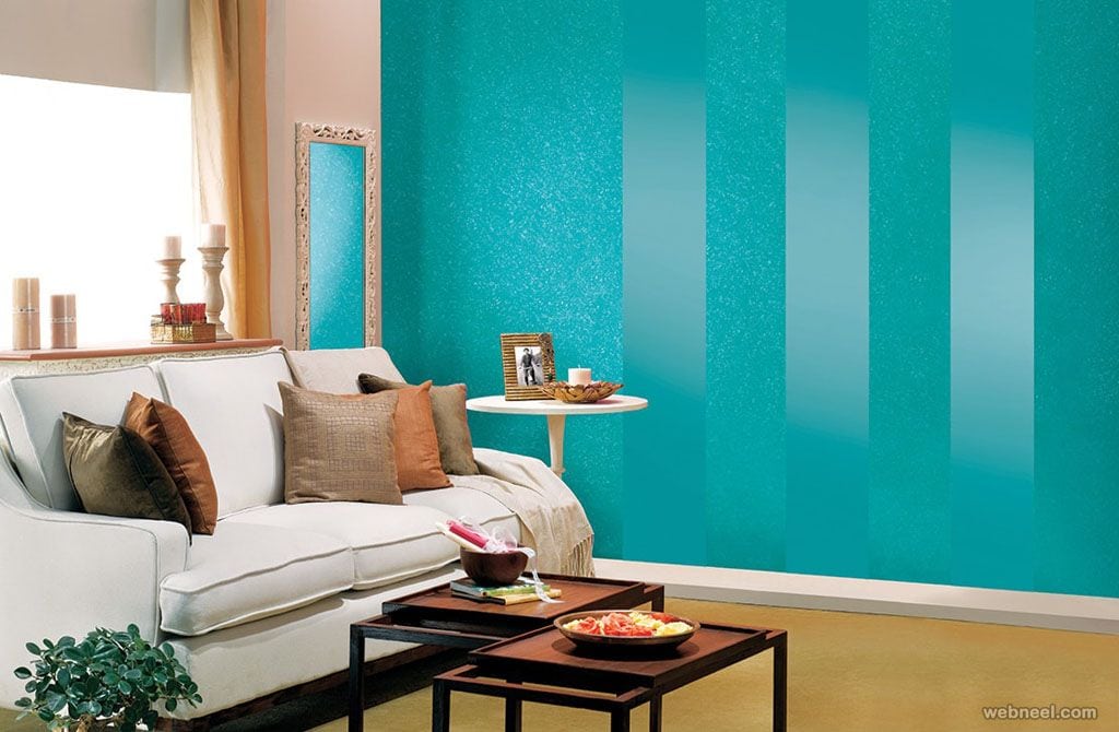
Color is more than decoration; it’s a powerful tool that shapes how we feel and interact within our living spaces. Every hue has a unique psychological effect, influencing emotions, energy levels, and even our perception of space. Warm tones like terracotta and mustard yellow infuse rooms with coziness and comfort, making them ideal for living rooms and dining areas. Cool shades such as soft teal and sage green promote relaxation, making them perfect choices for bedrooms and meditation spaces.
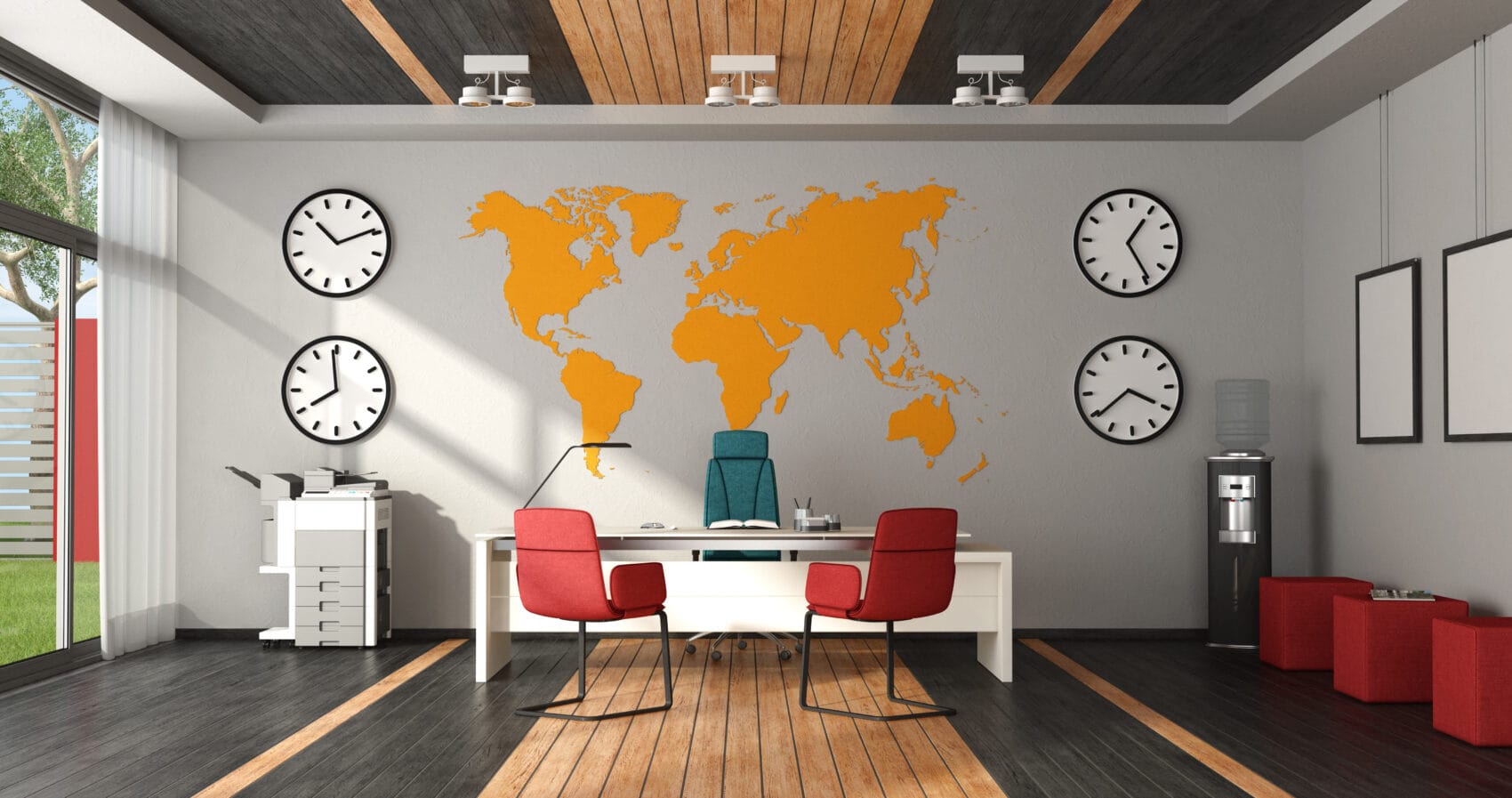
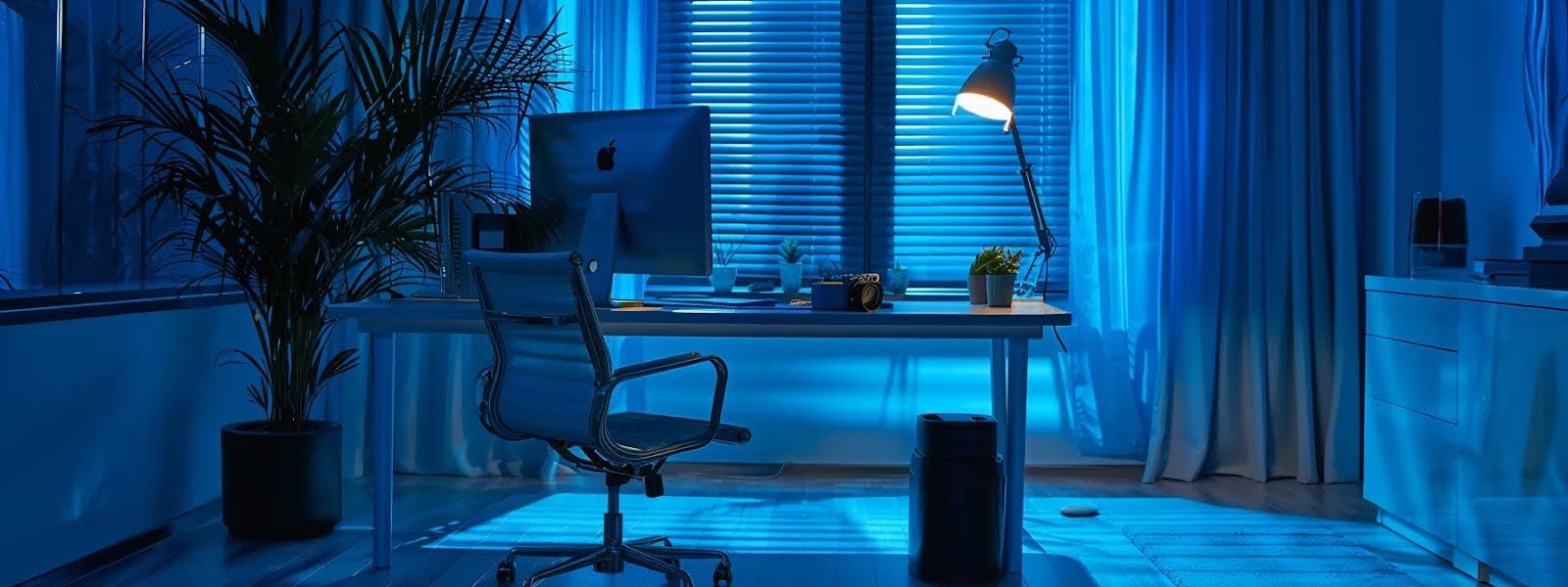
When choosing colors for your home, think about the function of each room. Kitchens and home offices benefit from energizing, vibrant tones that boost focus and productivity. Bedrooms and bathrooms, on the other hand, thrive with calming, neutral palettes that encourage rest and rejuvenation.
2026’s Most Inspiring Interior Color Trends
This year, the spotlight is on colors that connect us to nature and evoke a sense of calm and renewal. Here are the top trends to consider:
-
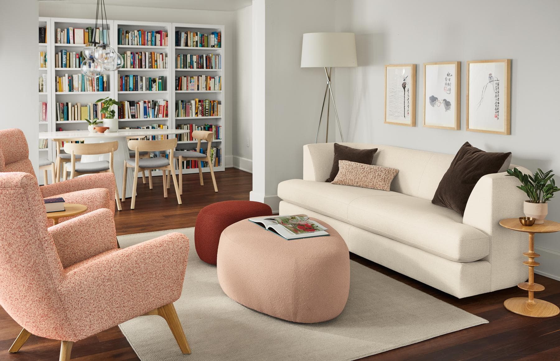
Earthy Neutrals: Chalky rose, sunbaked terracotta, and dusty olive are everywhere in 2026. These shades create a warm, grounded atmosphere that feels both timeless and modern.
-
Tranquil Teals: Blending blue and green, teal is a standout choice for living rooms and bedrooms. It’s bold enough to make a statement but soothing enough to promote relaxation.
-
Deep Greens: Earthy dark greens continue to dominate, offering a restorative and sophisticated backdrop for any room.
-
Rich Plums: Plum shades add a touch of luxury and elegance, perfect for accent walls or statement furniture pieces.
-
Balanced Palettes: The 60-30-10 rule remains a go-to for achieving harmony: 60% dominant color, 30% secondary color, and 10% accent color.
How to Choose the Perfect Color Palette
Picking the right palette involves more than just following trends. Consider these steps to ensure your colors work beautifully in your space:
-
Assess the Room: Evaluate the size, lighting, and primary use of each room. Large, sunlit spaces can handle deeper tones, while smaller rooms benefit from lighter, airy colors.
-
Test Paint Samples: Always test paint on your walls to see how it changes with different lighting throughout the day.
-
Balance Bold and Neutral: Pair vibrant accent colors with neutral backgrounds for a cohesive and visually appealing look.
-
Add Texture: Incorporate textured finishes and complementary accessories like rugs, throw pillows, and artwork to add depth and interest.
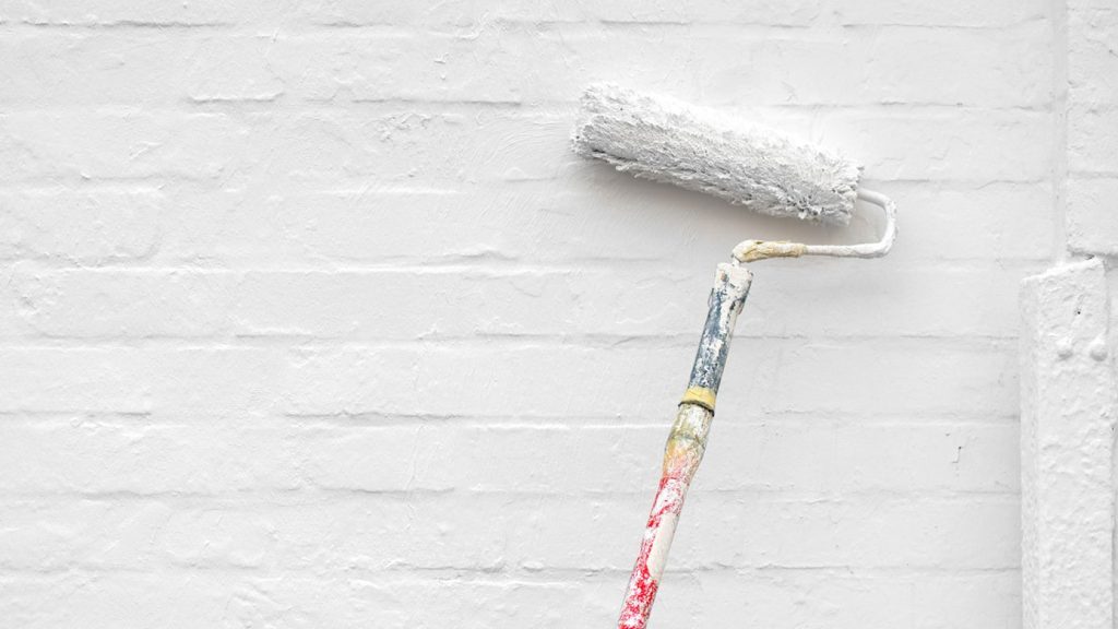
Practical Tips for Painting Interiors
-
Prepare Your Walls: Clean and prime your walls before painting for a smooth, long-lasting finish.
-
Invest in Quality Paint: High-quality paint offers better coverage and durability, saving you time and money in the long run.
-
Use Accent Walls: Create visual interest with an accent wall in a bold or unique color.
-
Coordinate with Furniture: Ensure your color choices complement your existing furniture and decor.
Frequently Asked Questions
1. What are the best colors for a calming bedroom?
For a peaceful bedroom, choose soft, cool tones like lavender, dusty blue, or pale green. These shades promote relaxation and help create a serene environment conducive to sleep. Avoid bright or warm colors, which can be stimulating and disrupt rest.
2. How can I make a small room look bigger with color?
Use light, neutral colors such as white, cream, or light gray to make a small room appear larger. These colors reflect light and create an airy, open feel. Dark or saturated hues can make a space feel cramped and enclosed.
3. What are the top color trends for living rooms in 2026?
In 2026, living rooms are embracing earthy tones like tobacco brown, dusty olive, and sunbaked terracotta, as well as tranquil teals and rich plum shades. These colors add warmth and sophistication while maintaining a connection to nature.
4. How do I choose a color palette for my home?
Start by considering the mood you want to create in each room. Use the 60-30-10 rule for a balanced palette: 60% dominant color, 30% secondary color, and 10% accent color. Test paint samples in your space and coordinate with your existing furniture and decor.
5. Can I mix bold colors in my home interiors?
Yes, bold colors can be mixed effectively by balancing them with neutral backgrounds and using the 60-30-10 rule. Pair vibrant accent colors with soft, neutral tones to avoid overwhelming the space. Consider using bold colors on accent walls or in accessories for a pop of energy.