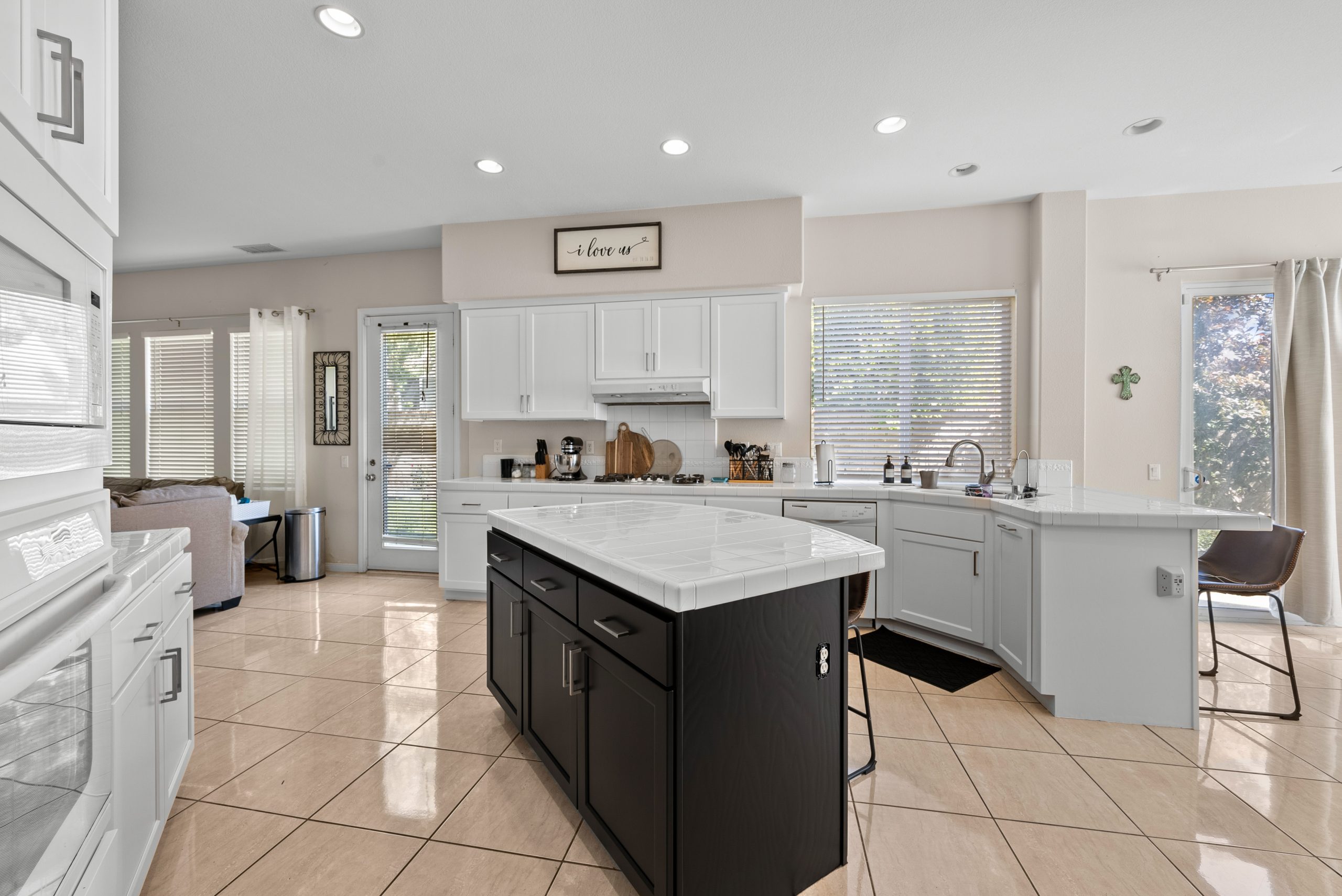
Successful Painting Techniques for Santa Clarita Open Concepts
Open floor plans are a defining feature of Santa Clarita homes, offering expansive light, clear sightlines, and a sense of connection. But painting these spaces requires a thoughtful approach—simply matching every wall can make the layout feel flat and uninviting. The secret to a stunning open concept interior lies in guiding the eye with subtle color shifts, harmonious undertones, and strategic placement, so each area feels distinct yet cohesive. At New Life Painting, we’ve developed a proven method to help your home achieve balance and character without repetition.
Create a Cohesive Palette
When planning your paint scheme, think of your color choices as the backbone of your design—each color plays a specific role. For most open layouts, limiting your palette to three to five shades (including trim and ceiling) ensures visual interest without overwhelming the space:
-
Primary color: Serves as the main backdrop for the largest walls.
-
Secondary color: Adds gentle contrast for smaller zones like breakfast nooks or hallways.
-
Accent color: Used sparingly to highlight architectural features or create focal points.
-
Trim and doors: Choose a warm or bright white to define edges.
-
Ceiling: Either a shade lighter than the walls or the same as trim for a lifted effect.
Using a limited palette with purpose keeps the space dynamic and unified.
Harmonize Undertones for Consistency
Open-concept homes share natural light, so it’s essential that undertones complement each other throughout the layout. Whether you opt for light or deep shades, stick to one undertone family—warm gray-beige, creamy off-white, or clay-inspired neutrals.
Test for harmony: Place your top color choices next to a true white card and a sample of your flooring or cabinetry. If they blend seamlessly, your palette will work well across the entire home.
Map Your Colors by Light and Layout
Sketch a simple floor plan and note sun exposure for each area:
-
East-facing: Cool morning light makes colors appear lighter.
-
South-facing: Intense midday sun intensifies warmth.
-
West-facing: Late-day light brings out yellow and red tones.
-
North-facing: Soft, cool light gives colors a grayer appearance.
Assign roles to each color:
-
Primary: Covers living room walls and main circulation paths.
-
Secondary: Appears on dining or kitchen walls near cabinetry.
-
Accent: Reserved for features like fireplaces or media walls.
-
Trim/doors/ceiling: Remains consistent throughout.
This approach prevents accidental color mismatches and ensures every choice is intentional.
Santa Clarita’s Light: Choose Warm Neutrals
Santa Clarita’s sunny climate can make cool grays look harsh in the afternoon. Warm neutrals—such as cream, light greige, mushroom beige, and soft taupe—stay inviting throughout the day and pair beautifully with local flooring and cabinetry. For a modern twist, select warm grays with a subtle beige undertone.
Need help testing paint samples under real Santa Clarita light? Our team can bring swatches and brush-outs directly to your home.
Smart Strategies for Color Zoning
-
Vary Depth, Not Hue: Keep colors in the same family and adjust the depth for different zones. This creates a layered look without disrupting harmony.
-
Play with Texture and Sheen: Use eggshell on walls, semi-gloss on trim, and matte on ceilings to add subtle contrast. In kitchens, choose washable matte or satin finishes for durability.
-
Place Color Breaks at Natural Dividers: Stop and start colors at inside corners, columns, or beam lines—never mid-wall.
-
Use Tone-on-Tone Trim: Paint trim the same color as walls, but in semi-gloss, for a sleek, modern effect.
-
Accent Doors: Paint interior doors one shade deeper than trim for visual rhythm down hallways.
Real-World Layout Examples
Great Room with Central Island
-
Living walls: Light warm greige
-
Kitchen surround: One step deeper to frame cabinets
-
Dining niche: Deeper kitchen tone or clay-warm neutral
-
Fireplace or media wall: Accent color to echo flooring or stone
Shotgun Layout (Kitchen → Dining → Living)
-
Perimeter walls: Main color for continuity
-
Short end walls: Secondary color to define zones
-
Accent: One feature wall at the far end
L-Shape Layout
-
Long leg: Main color
-
Short leg: Secondary color
-
Accent: Vertical architectural element visible from both legs
Anchor Your Palette with Floors and Cabinetry
-
Oak or maple floors: Pair with warm whites or light greige.
-
Walnut or dark floors: Use soft taupe for contrast.
-
White shaker cabinets: Opt for creamy or mushroom-neutral walls.
-
Warm stone or travertine: Choose gentle greige to complement veining.
Consider updating cabinets for a unified look—our cabinet painting team delivers a durable, furniture-grade finish.
The Three-Color Rule
Limit your palette to:
-
Main color (dominant)
-
Secondary color (adjacent zones)
-
Accent color (one feature per sightline)
-
Trim/ceiling (consistent throughout)
For more variety, update materials, art, or textiles instead of repainting.
Accent Walls Done Right
Accent walls work best on architectural features—fireplaces, built-ins, or bookcase backs. Keep the accent one to two steps deeper than the main wall color for a calm, sophisticated effect.
Sheen Selection for Open Spaces
-
Matte/Flat: Ceilings and low-traffic areas
-
Eggshell: Most walls
-
Satin: Hallways, kitchens, and high-traffic zones
-
Semi-Gloss: Trim, doors, and built-ins
Keep sheen transitions at trim lines or corners for a polished look.
Sample Colors in Real Light
Test large swatches (12×12 or larger) in different areas:
-
Near island pendants (evening light)
-
Opposite sliders (midday sun)
-
On the longest wall (glancing light)
-
Next to floors and cabinets
Check the color at morning, noon, sunset, and lamplight. If it works in all conditions, it’s a winner.
Trim and Ceiling Ideas
-
Classic Contrast: Warm white trim with slightly darker walls
-
Gallery Calm: Walls and trim in the same color, trim in semi-gloss
-
Lifted Ceilings: Ceiling one shade lighter than walls
-
Feature Doors: One step deeper than trim for subtle punctuation
Warm, Unified Color Combos
-
Creamy Warm White + Sun-Lit Greige + Putty Door
-
Feather Taupe + Linen-White Trim + Deeper Greige Fireplace
-
Mushroom Beige + Soft Clay Accent + Warm White Ceiling
-
Light Warm Gray + Oak Floors + Tone-on-Tone Trim
Each combo works within a warm undertone family, allowing for easy mixing of metals and textures.
Transitional Zones: Hallways, Stairs, Nooks
-
Hallways: Main color in eggshell
-
Stairwells: Main color or one step deeper
-
Reading nooks/built-ins: Accent color for dimension
Painting for Homes with Kids and Pets
Choose washable finishes in the same sheen family for major walls. In high-traffic areas, use a secondary color one step deeper to hide wear.
Crisp Lines for a Polished Look
-
Precise caulk lines at transitions
-
Smooth patches on long runs
-
Consistent roller nap and direction
These details elevate your finish from good to exceptional.
Updating Your Palette Over Time
-
Keep main field and trim as constants.
-
Refresh accent walls or door colors every few years.
-
Rotate textiles and art for seasonal changes.
Step-by-Step Painting Process
-
Gather inspiration from existing finishes.
-
Shortlist 3–5 colors in one undertone family.
-
Build a color map based on light and layout.
-
Test large samples at different times of day.
-
Lock in sheens: eggshell walls, semi-gloss trim, matte ceilings.
-
Sequence work by zones for seamless results.
-
Final walkthrough in evening light to confirm harmony.
Our Santa Clarita team can guide you through every step.
Avoid Common Mistakes
-
Don’t use one color everywhere—vary depth and sheen.
-
Choose accent walls based on architecture, not whim.
-
Test undertones against floors and cabinets.
-
Limit palette to three walls plus trim/ceiling.
-
Keep sheen changes at trim lines or corners.
Why Choose New Life Painting
-
We design palettes that flow with Santa Clarita light.
-
Our prep and masking ensure crisp, long sightlines.
-
We sequence work for consistent sheen and clean edges.
-
Our finishes are durable and easy to maintain.
Explore our full process and portfolio.
FAQs
1. How many wall colors work best in an open concept?
For most open layouts, two to three wall colors—plus trim and ceiling—strike the perfect balance. Use depth and sheen changes for variety, not additional hues, to keep the palette cohesive.
2. Are cool grays suitable for Santa Clarita homes?
Cool grays can work, but they may look harsh in Santa Clarita’s bright sun. Warm-leaning grays or greiges are safer for a friendly, all-day look. If you prefer a modern style, choose warm grays with a subtle beige undertone.
3. Where should I place color breaks in open floor plans?
Stop and start colors at natural architectural features—inside corners, columns, or beam lines. Avoid mid-wall breaks to maintain a smooth, unified flow.
4. Do accent walls still work in open concept homes?
Yes, accent walls are effective when they highlight architectural features like fireplaces or built-ins. Keep the accent one to two steps deeper than the main wall color for a calm, sophisticated effect.
5. Should trim always be white?
Trim doesn’t have to be white. Tone-on-tone trim (same color as walls, semi-gloss finish) creates a modern, streamlined look. Warm white trim offers classic contrast and timeless appeal.


