Welcoming Color Ideas for Your Guest Bedroom – Stylish Retreats
Color is more than a visual choice; it’s a psychological tool that shapes how people experience a space. In guest bedrooms, the right palette can foster relaxation, inspire energy, or offer a sense of luxury. Understanding the emotional impact of different colors helps you design a room that not only looks beautiful but also supports your guests’ comfort and well-being.
Cool Tones for Serenity
Cool colors such as navy, soft blue, and muted green are renowned for their calming effects. These shades help lower stress levels and promote restful sleep, making them ideal for bedrooms. When paired with natural materials like wood or linen, cool tones create a soothing, spa-like atmosphere that welcomes guests to unwind.
Warm Tones for Comfort
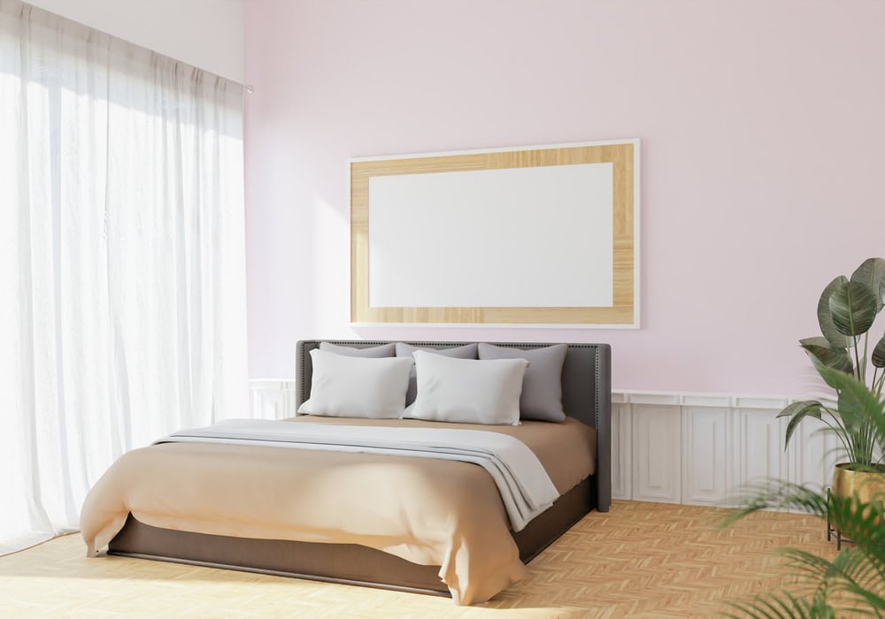
Warm hues like buttery yellow, peachy pink, and soft beige bring brightness and coziness to a room. These colors evoke feelings of warmth and comfort, making guests feel instantly at home. Warm tones are especially effective in rooms with limited natural light, as they can brighten the space and create a cheerful ambiance.
Neutral Shades for Versatility
Neutral colors like warm whites, greys, and beiges offer a timeless and versatile foundation. These shades work well with a variety of decor styles and can be easily updated with accent pieces. Neutrals also provide a calming backdrop that allows guests to relax and focus on the room’s overall atmosphere.
Earthy Tones: Bringing Nature Indoors
Warm Neutrals for a Calm Retreat
Warm neutral shades such as Mauvey Beige and Farrow & Ball’s Pointing are perfect for creating a serene and inviting guest bedroom. These colors shift subtly with natural light, adding warmth and depth to the space. Their understated elegance makes them a versatile choice for any decor style, and they pair beautifully with natural textiles and wood finishes.
Earthy Browns for a Cozy Vibe
Brown tones, like Char Brown by Benjamin Moore, add richness and warmth to a guest bedroom. When combined with neutral accents, these hues create a grounded and sophisticated atmosphere. Earthy browns complement textures like linen, wool, and leather, enhancing the tactile comfort of the room. Their adaptability to different lighting conditions makes them a timeless choice for a cozy retreat.
Vibrant Accents: Adding Personality and Energy
Bold Colors for a Statement
Bright hues like Butter Yellow and Chartreuse can instantly uplift a guest bedroom, infusing it with energy and personality. These shades work best in rooms with plenty of natural light, where they can harmonize with cream and brown accents. Using bold colors as an accent wall or on decorative elements adds visual interest without overwhelming the space.
Accent Walls for Dimension
Accent walls are a creative way to add dimension and focus to your guest bedroom. By choosing a contrasting color or pattern, you can highlight architectural features or define different zones within the room. For example, a pink and brown striped wall can serve as a playful yet sophisticated focal point, while deep forest green moldings add depth and character.
Soft Pastels: Timeless Elegance
Calming Blues and Greens
Soft blues and muted greens create a tranquil sanctuary that invites relaxation. Shades like Sherwin-Williams’ Sea Salt and Benjamin Moore’s Summer Shower offer a breezy freshness while maintaining sophistication. These colors work beautifully in guest bedrooms with ample natural light, amplifying a sense of openness and calm. Layering with natural textures and neutral furniture keeps the palette grounded, ensuring the space feels serene and welcoming.
Gentle Pinks and Peaches
Pearlized blushes and soft peach tones bring warmth and softness to a guest bedroom. Colors like French & French’s peachy pink, with their orangey undertones, create a comforting embrace that makes guests feel instantly at home. This palette pairs elegantly with deeper hues or natural wood finishes, balancing vibrancy with calm. Incorporating subtle mural bands or ceiling details further enhances architectural interest and approachable femininity.
Deep Shades: Luxurious Retreats
The Allure of Dark Colors
Dark hues like deep blue-black or mossy greens invite an intimate, cocooning atmosphere, perfect for a guest room meant to feel like a luxurious escape. These colors absorb light, creating depth and privacy. Choosing shades like Great Barrington Green or shadowy navy adds visual drama without overwhelming, encouraging guests to unwind fully in a serene retreat.
Balancing Dark Hues with Light Accents
Balancing bold, dark walls with lighter accents is a refined way to keep the room from feeling too heavy. Crisp whites or soft creams on trim, moldings, or textiles bring contrast that refreshes the space and amplifies the luxe feel. Subtle wallpaper patterns or light-colored ceiling treatments alongside dark walls add dimension while maintaining balance. Layering light accents against rich dark colors prevents the room from feeling cave-like, ensuring it remains inviting and airy.
Integrating Patterns: Beyond Solid Colors
Creative Use of Stripes and Textures
Stripes bring sophistication to a guest room without overwhelming it. Swapping a traditional headboard for contrasting pink and chocolate brown stripes frames the bed, softening boldness with neutral drapery and gentle lighting. Textured elements—like plaster walls or rough fabrics—elevate simple stripes into a tactile experience, adding depth while maintaining a restful vibe. Experiment with varying stripe widths or painterly effects to avoid rigidity.
Incorporating Patterned Wallpaper for Depth
Patterned wallpaper offers visual interest that paint alone can’t achieve. Delicate florals, gentle geometrics, or layered stripes add dimension and rhythm to your guest bedroom. Pair wallpaper thoughtfully with paint—like combining deeper toned wallcovering with lighter walls—to build dimension and invite the eye to explore the space more intimately. Wallpaper works beautifully on focal walls, ceiling borders, or architectural details for unexpected style points.
Lighting’s Role: Enhancing Color Perception
Natural vs. Artificial Light
Natural light reveals the truest form of your chosen paint colors, often making warm tones glow with subtle undertones. Artificial lighting can shift how colors appear—incandescent bulbs enhance warmth, while LED lights emphasize blues and greens. Test paint swatches at various times of day and under different lighting sources to understand how your guest room’s colors will truly evolve.
Layering Lights to Highlight Your Palette
Combining multiple light sources creates depth that sharpens and enriches bedroom colors. Use ambient lighting alongside task and accent lights to showcase subtle hues and add warmth to deeper shades. Layering involves ceiling fixtures for overall illumination, bedside lamps or wall sconces for softer, focused light, and accent lighting to highlight textured wall details or painted moldings. This thoughtful combination ensures your guest bedroom’s color palette always feels dynamic and inviting.
FAQ
Q: What colors are best for creating a relaxing guest bedroom?
A: Cool tones like navy, baby blue, muted green, and soft blue are excellent for fostering a calm and serene atmosphere. These shades promote relaxation and restful sleep, making them ideal for a guest bedroom. For example, Sea Salt by Sherwin-Williams offers a muted green with blue undertones that creates a peaceful “treehouse” feel. Soft blues like Summer Shower by Benjamin Moore maintain a refreshing and timeless vibe suitable for all ages.
Q: How can I use bold colors in a guest bedroom without overwhelming the space?
A: Bold colors like chartreuse, lively green, or yellow-green can add energy and personality when balanced with neutral tones. Use bold hues on accents such as picture frame molding or millwork to add visual interest without overpowering the room. Pair these colors with creams, browns, or soft whites to create a welcoming and lively yet cozy retreat. Accent walls, textured details, and patterned accessories help distribute boldness throughout the room.
Q: Are warm neutral colors suitable for guest bedrooms?
A: Warm neutrals such as mauvey beige and butter yellow provide a versatile and inviting backdrop that enhances natural light and creates a soothing environment. Butter Yellow, showcased in a California ranch home with cream and brown accents, creates a peaceful sanctuary, while Mauvey Beige’s subtle pink undertones add warmth and serenity. These tones make the guest bedroom feel comfortable and adaptable to various decor styles and preferences.
Q: Can dark colors be used in a guest bedroom, and how can they be balanced?
A: Dark colors like deep blue-black or mossy greens create an intimate, cocooning atmosphere perfect for a luxurious escape. These hues absorb light, adding depth and privacy. Balance dark walls with lighter accents such as crisp whites or soft creams on trim, moldings, or textiles. Subtle wallpaper patterns or light-colored ceiling treatments further enhance contrast and dimension. Layering light accents against rich dark colors prevents the room from feeling cave-like, ensuring it remains inviting and airy.
Q: How does lighting affect color perception in a guest bedroom?
A: Natural light reveals the truest form of paint colors, making warm tones glow with subtle undertones. Artificial lighting can shift how colors appear—incandescent bulbs enhance warmth, while LED lights emphasize blues and greens. Always test paint swatches at various times of day and under different lighting sources to understand how your guest room’s colors will evolve. Layering multiple light sources sharpens and enriches bedroom colors, ensuring the palette feels dynamic and inviting throughout the day.